Role
Senior Product Designer
Half a million titles in the catalogue and about a dozen of them on screen, which turned out to be a merchandising problem wearing a navigation problem’s clothes.
Default browse surfaced whatever was already popular, which kept it popular, and those same titles were the worst-margin redemptions on the platform. The screen had been making a financial argument on the company’s behalf for years, and losing.
The fix: rebuild browse from a fixed taxonomy into modular content blocks Marketing could reorder and populate themselves — curated collections like “Summer Stories” alongside “Mystery, Thriller & Horror,” no dev tickets. Plus a persistent mini-cart, so picking a title no longer yanked you out of discovery.
The result: +5.3% curated redemptions, +10.2% VIP, from a 10% / 30-day A/B test that rolled out to all subscribers.
You are a subscriber to an audiobook platform that offers half a million titles, and you’re excited to find something amazing to listen to on your long commute. So you open the app and on your browse tab, you see the same dozen or so covers you saw yesterday — A Game of Thrones, Stephen King, the big romance titles of various flavours of highlander or fae king with a penchant for misunderstood, bookish ladies, whatever Reese’s Book Club just picked. You’ve been a subscriber for a year and you’re running out of obvious picks. So you redeem a credit on one of the few titles you haven’t encountered previously, close the app after giving it a half-hearted go, and depending on how exasperated you feel today, maybe decide that it’s time to cancel.
There were half a million titles in the catalogue, but they might as well have been half a million alien planets floating about in outer space, because you’re definitely not finding them. In fact, you spend more time searching and deciding than actually listening.
This wasn’t a recommendation bug. It was the default browse behaviour of so many platforms we all use every day, surfacing what was already popular, which made it even more popular, which kept it at the top. A feedback loop nobody intended, but nobody had questioned either.
Audiobooks.com runs on a credit-based subscription. You pay fifteen bucks a month, you get a credit, you spend it on any title in the catalogue — whether it’s a book that retails for $12 a la carte, or a book that retails for $35. Same credit. When a subscriber redeems for the expensive bestseller, the company is paying the publisher more than the credit brought in. The math is more layered than that, but the basic mechanism is the same: the most visible titles in browse were the ones that left the least amount of money on the balance sheet.
The worst of the whole thing: the thousands of titles Marketing had curated and promoted and partnered on sat invisible. These were the titles where the economics actually worked, where engagement and retention would flourish, and they sat buried behind a convoluted genre and sub-genre taxonomy that wasn’t as intuitive as it seemed.
Three teams needed different things from the same screen.
Marketing had ideas — “AAPI Authors,” “Summer Stories,” “Books with Buzz” — but the genre taxonomy on the back end wasn’t particularly amenable to quirky seasonal renaming. There was no way to easily create new semantic groupings that made sense to Marketing and to our users without convoluted back-end admin weirdness. Their ability to deploy curated content targeting specific seasons, events and releases was basically reduced to “sigh… I guess it will have to do.”
Dev wanted browse to evolve without having to literally refactor the entire database from the ground up, and even more importantly, to build it right with a proper understanding of the driver for the change — rather than drowning in “can we just get this quick change?” requests every week.
Users kept getting yanked out of discovery, even in the case of monthly VIP titles, which as an added bonus allowed premium members to select another free title. Except that list grew every month, and soon enough you were faced with the same issue — a couple hundred titles without a meaningful way to find the one you want. Worst of all, as you’re browsing and tap one to select it, the app pulls you right into a confirmation screen. You wanted to compare three or four before deciding, maybe see what you’re in the mood for this month. Instead, you have to back out, go back to the main browse, and try again. Like a bookstore where picking something up to look at it blasts a foghorn that gets the security guy to immediately escort you to the cashier.
We were handed a discovery redesign brief with a twofold goal: shift credit redemptions toward better-margin catalogue content, and allow Marketing to get the content they knew people wanted in front of them, increasing engagement and retention. Seems simple, but it meant that content browse and discovery needed conceptual reframing.
So we rebuilt it as a merchandising system. Browse went from a fixed taxonomy to modular content blocks that Marketing could reorder and populate on their own — no Jira tickets, no perpetual hacks that “shouldn’t take too long, right?” Curated collections like “Summer Stories” could sit alongside “Mystery, Thriller & Horror” without rewriting the category structure. Marketing got to editorialize, and users got pathways into the catalogue that popularity sorting would never create — or would actively push further back into invisibility.
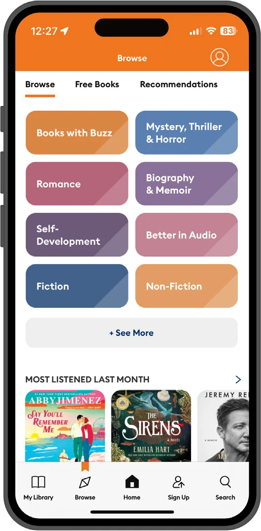
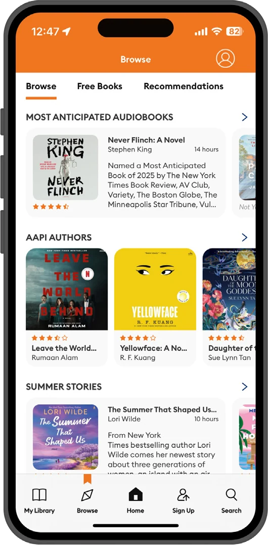
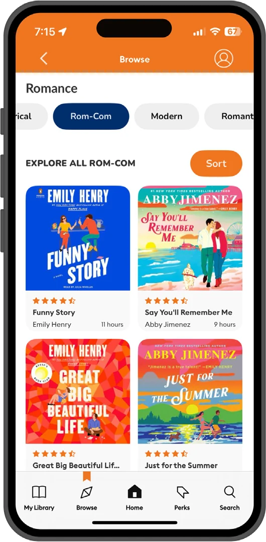
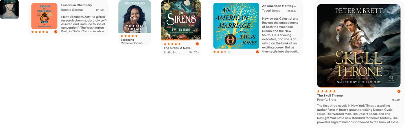
VIP wasn’t even the primary vehicle here — it just benefited from the same restructuring. Once browse had real editorial pathways instead of just genre buckets, the back-catalogue content that VIP was built around actually got found, and the extra credit became a meaningful retention tool.
We also designed a persistent mini-cart for the redemption flow. Instead of forcing you to commit to one title and leave browse, your selection stayed visible while you kept exploring. Pick one, keep looking, pick another, remove the first, confirm when you’re ready.
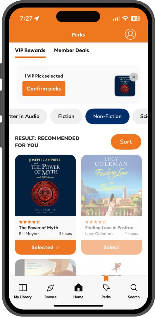
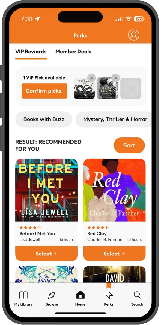
10% A/B test, 30 days. Marketing updated the curated lists weekly, which was really a way of finding out whether the system could keep pace with their editorial calendar or whether we’d built something that only worked when nobody touched it.
Browse at this scale is not merely an interface and navigation problem: it’s a fundamental structural problem. Like building a massive library, stuffing it with more books than can be read in a thousand lifetimes, and then asking a person to pay you for the privilege of being set loose to navigate the endless aisles with zero guidance.
We had to make it easier for them to get to the right book, but that required making the library a more human place, built around how people think. Understanding that allowed us to forge a relationship with our customers that went beyond their LTV and became a matter of trust. We could help them discover books that would bring them joy — and joyful people stick around.